
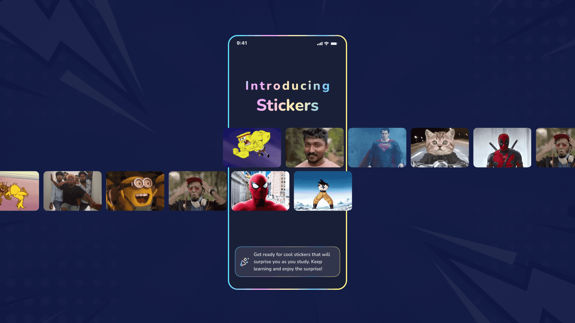
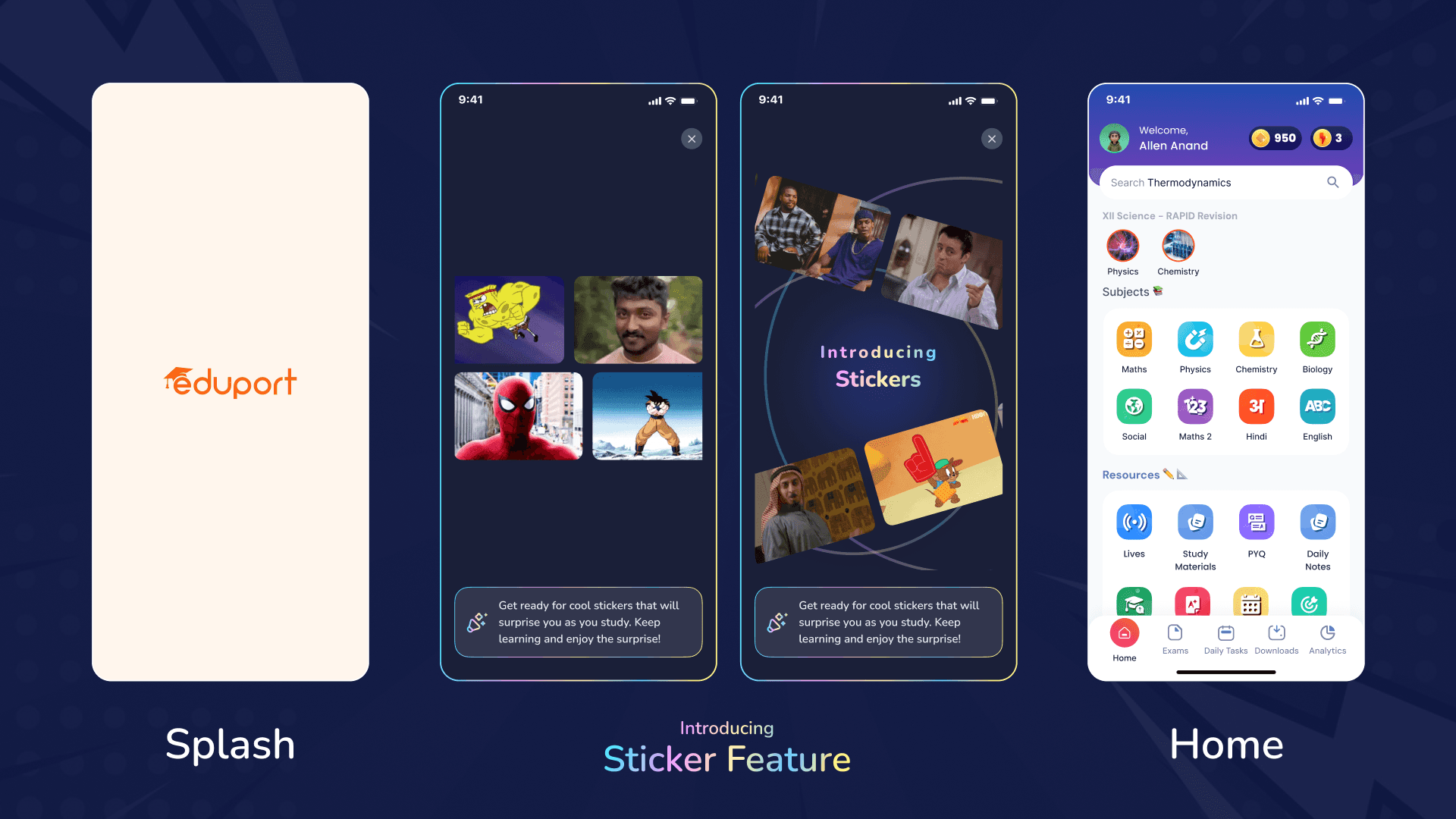
Making Rewards Feel Alive
Building a sticker-based reward system that motivates and surprises users wasn’t just about visuals—it was about creating something dynamic and human-like. Through ten iterations, we crafted a feature that celebrates milestones, adapts to user behavior, and makes every achievement feel personal and rewarding.
Introduction
Every design tells a story, and the journey of reimagining Eduport’s onboarding experience was no different. My aim was to go beyond mere functionality and create an experience that sparks curiosity, fosters engagement, and builds an emotional connection. This onboarding journey was designed to inform, delight, and bring a smile to every user’s face.
The Challenge
Eduport’s existing onboarding flow had the basics covered but lacked the emotional spark that connects users to the brand. Feedback revealed that users often felt disconnected, and the experience failed to highlight the app's most exciting features.
The key challenge was to balance simplicity with engagement. How could we introduce fun, meaningful interactions without overwhelming the users? The solution lay in thoughtful animations, a focus on storytelling, and a touch of playfulness.
Defining the Symbol
Designing the symbols for emotions was a pivotal step in creating Eduport's "What's New" feature. Rather than focusing solely on the aesthetics, we crafted symbolic elements that evoke emotional responses, tying them to the app's core functionalities. Each symbol is a visual representation of user actions or outcomes, from celebrating success to comforting users after challenges.
The symbols go beyond static visuals; they are dynamic, serving as emotional cues within the app. For instance, a blue cloud-like burst provides comfort after failure, while a green starburst sparks joy during a celebratory moment. These symbols, paired with subtle animations, create a cohesive experience that resonates with users on a personal level, making their learning journey engaging and emotionally meaningful.
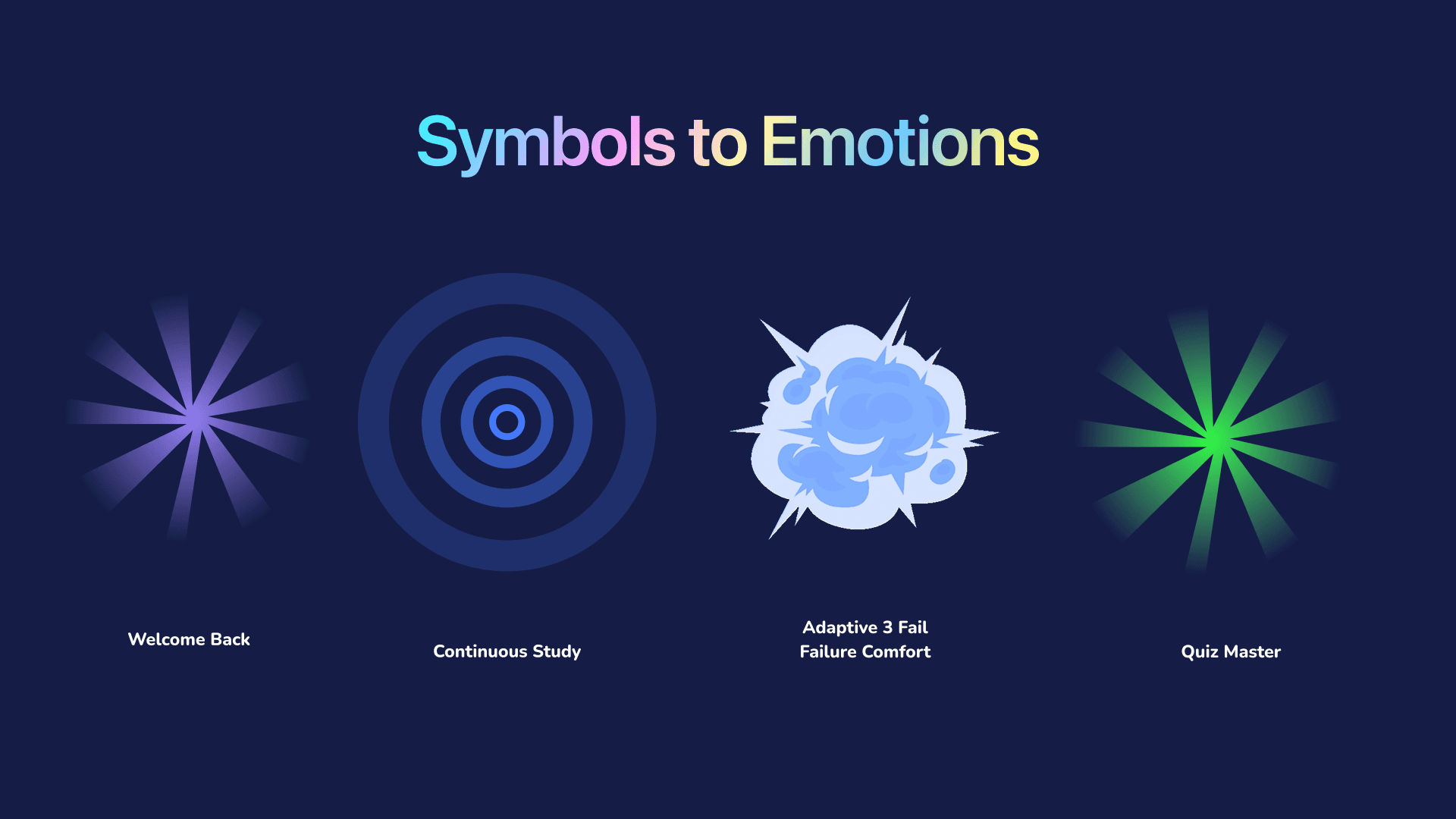
Symbol Breakdown
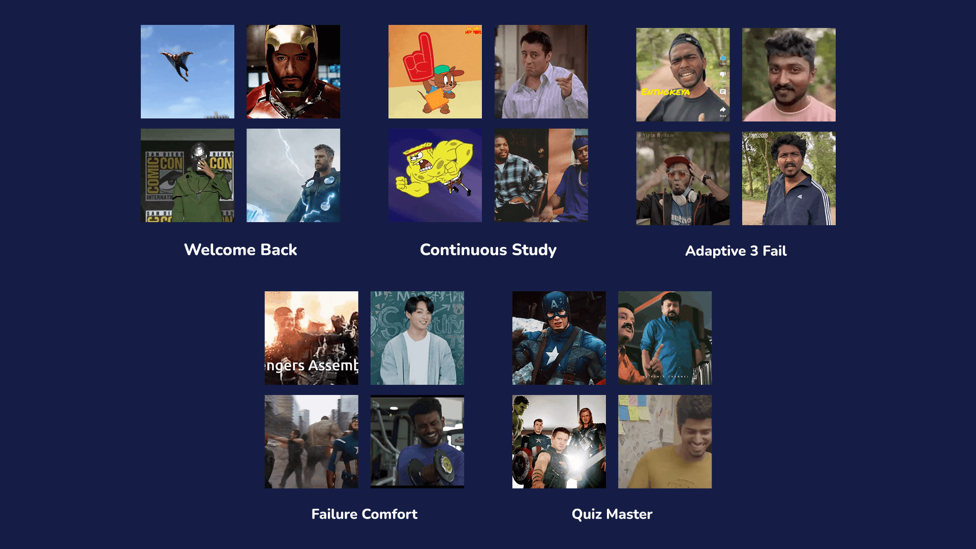
1. Welcome Back
Symbol: Faded, welcoming starburst.
Emotion: Warmth and encouragement.
Placement in UI: Shown in the onboarding sequence to greet returning users with positivity.
2. Continuous Study
Symbol: Circular ripple.
Emotion: Progress and focus.
Placement in UI: Visible during streak milestones, encouraging users to keep learning.
3. Adaptive Fail and Failure Comfort
Symbol: Blue cloud-like burst.
Emotion: Comfort and empathy after failure.
Placement in UI: Triggered after failed quizzes, acknowledging the effort while motivating users.
4. Quiz Master
Symbol: Green starburst.
Emotion: Celebration and success.
Placement in UI: Appears after achieving a perfect score in quizzes, rewarding users.
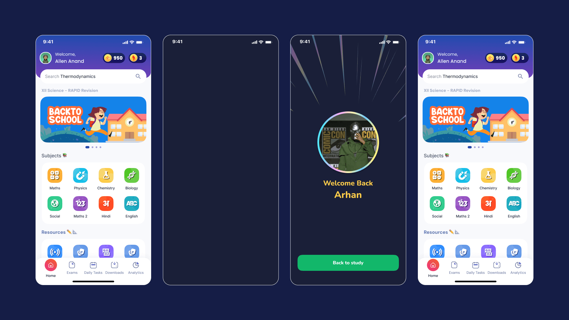
Welcome Back
Animation 👉https://youtube.com/shorts/xeUgVZChxKM?feature=share
The "Welcome Back" feature is designed to create an emotional connection the moment students re-enter the app. At its core, the welcoming starburst symbolizes warmth, familiarity, and encouragement. Its primary goal is to make the user feel valued and comfortable, creating a safe space where learning doesn't feel like a chore but rather an exciting return to progress.
Purpose
This section is not just about greeting users—it’s about acknowledgment. The subtle animation of the starburst triggers a psychological sense of belonging, reminding users that their effort matters. It reinforces consistency and nudges users to maintain their learning habits.
Emotional Impact
For students, returning to an app that feels warm and welcoming helps ease anxiety and creates an optimistic mindset for studying. It cultivates positivity, transforming learning into a familiar, supportive experience rather than an intimidating task.
Continue Study
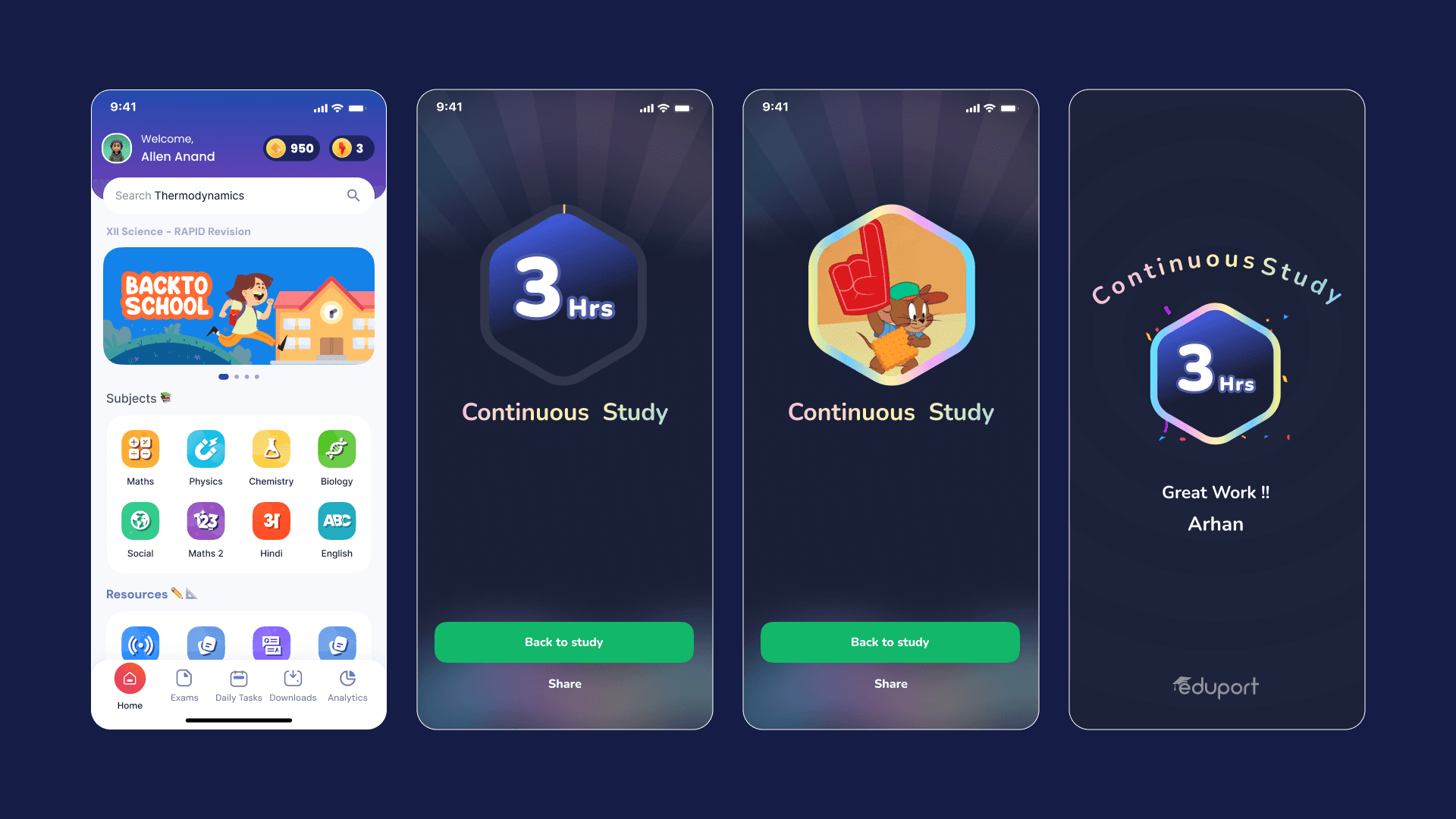
The "Continue Study" feature emphasizes persistence and dedication. Represented by a ripple effect, this feature visually symbolizes uninterrupted progress, motivating students to keep moving forward.
Purpose
The ripple effect creates a sense of continuity, reminding students of their study streaks or recent progress. It acts as a bridge, connecting the effort they’ve already put in to the next achievable milestone.
Emotional Impact
Seeing their progress visually represented as a ripple reinforces a sense of accomplishment, even if the journey is incomplete. This helps reduce burnout and builds a habit of consistent learning, making students feel that every little step matters.